Showing posts with label photography. Show all posts

Friday, May 2, 2014

Scrapping one great photo

If you've read my blog for a while, you know I love big pictures. When I get a photo I love, I print it big.

The place I print locally doesn't print 12x12, but it does print 8x12, so with really interesting photos, I go for that. Here's a layout I made recently with a photo I loved:


I took this photo at the Mall of America after Lego Club Easter weekend. I had left the store after the club and came back to see my son on the floor, dreaming of Legos. I waited until the crowd had milled away, then I took this picture with my iPhone. I love the lined on the photos, plus the color.

The Basic Grey paper I picked was in the April Studio Calico kit. I loved it for three reasons:

  1. The lines allowed for journaling.
  2. The yellow and blue matched the photo.
  3. The white sort of blended into the shelf on the left.

When I made the page, I knew I wanted to add the title with an embellishment cluster near the place where my son it sitting. I pulled some stickers, the tag, and the flair, then added the chipboard stars after to highlight the yellow. Finally, I stitched the title down, which I needed to do since the letters were acrylic and tiny letter stickers, both of which are hard to keep down. Then I journaled above and below, including the title as a part of the journaling. Here's some details:


I did a few things I love here, in addition to the big photo. I used an embellishment cluster, I overlapped the photo, and I kept the focus on the photo, especially with the arrow pointing to my son.

So this was the latest page I made with a photo I loved and some of the things I did to highlight it. So I hope this National Scrapbooking Day, you pick one photo you love and scrap it with some of your favorite techniques!

Saturday, November 30, 2013

Picture the Holidays winner!

I entered the numbers into random.org, and here's the winner!
Blogger almadr said...
I love Christmas tunes - they always cheer me up and make me feel it's this special time of year again ;-)
Thanks for this giveaway!
November 29, 2013 at 4:28 PM

Congrats, almadr! Please email me by clicking the email button to the right or by emailing me at jennyrahnlarson at yahoo dot com and I will get you the info to sign up! Have fun!

Wednesday, November 27, 2013

Big Picture Classes giveaway!

The Thanksgiving holiday is almost upon us. My family will once again run the Turkey Day 5K in downtown Minneapolis. We are planning on running our giblets off.

In honor of the holidays coming up, I have a giveaway to share: an upcoming class from Big Picture Classes called Picture the Holidays. Here's the details:


Picture the Holidays with Tracey Clark
Another 31 Days of Festive Photography with Tracey Clark
12/01/2013 $36.00

About the Class
Spend this December taking inspired, artful photographs of the world around you, during the most wonderful time of the year. Picture the Holidays has been reframed and refreshed for 2013, with new prompts and new pictures to help you creatively and mindfully celebrate this season of joy!

This 31-day workshop, from photographer and author Tracey Clark, is the perfect remedy for the holiday hustle.

Every morning, you'll receive a seasonal photo prompt that will not only inspire your inner photographer, but will also encourage you to take a few moments to yourself to get creatively centered before the day's festivities begin. Inside the classroom, you'll also find a class creed, holiday photography tip sheet, live blog, active student gallery, and supportive classroom message board.

Since the holidays are coming up quickly, I'm going to leave this giveaway up for a few days. If you are interested in being considered for this giveaway, please leave a comment telling me something you love (or loathe!) about the holiday season. I will draw a winner at 12:00 noon Saturday, November 30 CST. Be sure to stop by and check if you are the winner--the class starts December 1st!

Tuesday, November 19, 2013

Finishing up pages after a crop

When I go away to a crop like I did a couple weekends ago at the Pine City Scrapbooking Company, I usually almost finish pages there. Most of the time I have to take them home and do some finishing touches. Those finishing touches are mostly journaling and titles, and rarely products I want to use but forgot at home. Here's some pages I finished at home this weekend, scrapping at home with my friend Sandra:


I put most of this page about my son's 11th birthday together in Pine City, but I wanted to interview my son for the journaling. I used the prompts called the currents which I learned about through Tina Aszmus. I have used these prompts on my son but never myself; I loved hearing what he had to say! I heartily recommend these prompts with your child. (Bonus geek points if you know why I put an owl on this page.) The next page I finished at home is also about my son's birthday:


I had taken this photo of my son at his birthday desk. The dark season in Minnesota has started, so the lighting was whack. I decided to use an action with it to make it look funky and (hopefully) detract from the grain. I think I used Pioneer Woman Colorized. I had this page completely done except the journaling. This weekend I got off my butt and did it. :-) I'm tending to ink the edges of journaling strips lately. It's a fun, easy accent. Then another page I had to finish the journaling on, this time about my childhood:


The trick on this page was the amount of the journaling. The story was bigger than the story on my son's page, so I had to figure out how to adhere the strips without obscuring all the circles. I opted to start the journaling on the circles and finish it up under the title.

Thank you for checking out my pages! I hope it gave you some insight into how I go about finishing up after a crop. (I swear, most of the time it doesn't take me weeks to do so! Sigh.)

Sunday, October 6, 2013

In defense of the selfie

Selfies are getting a bad rap today. People love to mock the selfies and the selfie takers, especially their lips (quack!). I disagree. I'm writing this post to defend the selfie.

I can't say that I've always taken selfies, but I remember one of the first I ever took. I was at Acadia N.P. in Maine, and we were at the top of Cadillac Mountain. I was overcome: I was at the spot that sees the sun for the first time every morning! I had to have a picture! I looked around, but no one was near me (my family was probably eating blueberries on another side of the summit). So I took out the camera, extended my arm, and took a selfie. Later I made this page, one of my favorites:


The photo is not great, but I loved the white space on the picture. This page might have started my love affair with scrapping on the white space,

Like my first selfie experience, selfies are great for recording an experience where no one else is handy to ask to take a photo. For the scrapper, selfies are also good for taking photos of yourself to use on "All about me" pages, like the one below:


I didn't take the photo with the page in mind, but after I'd taken photos of my sons shoveling snow, I decided to snap a photo of myself too, and I love it.

I also like selfies because they are a quick and easy way to take photos of me and my children:


This Week in the Life happened to overlap with tornado safety week, so I snapped the one on the left while we were in our tornado safety area. (Pardon my son's crazy eyes.)


My boys love posing for photos, and there's something warm about grabbing the camera and snapping a photo of us up close when no one is around. If I were to get up to set up the camera and timer, I think it would lose some of the warmth.

I also love recording dates with my husband:


OK, Vegas was a little more than a date. My parents babysat for me when I got a rare treat: I traveled to Vegas with my husband when he was there at a conference and I had a long weekend. Rather than asking people for a photo, I just turned and snapped photos of ourselves in front of the landmarks. Sometimes people did offer to snap--that's common in tourist areas--but it was really quick to snap a selfie.


The Guthrie was again a treat: I managed to get a babysitter the night I scored free tickets to the Guthrie. I took photos before and during intermission and made this page with them. (Note: I take better selfies than my husband. He's taller but he always decapitates me when he takes the shot. Therefore, I shoot. So to speak.)


Finally, I know that people dis selfies because of the infamous duck lips that people make. I don't think I make them--maybe I do?--but I don't care if I do. As you can see from the page below, which is made up of some timer photos and some shot with the help of a friend, I don't care about making funny faces in photos:


After all, it's for posterity.

Monday, September 9, 2013

How I photograph my pages

When I did a week-long blog for Write Click Scrapbook this year on two-page layouts, one commenter asked me how I photographed my pages. This summer I asked my son, the intrepid techie, to take pictures of me while I took pictures of my page. (pardon the blur on the photos--the shots were good but I saved the photos too large for what I should've from a phone. Oops.) Here's the scoop, in all its steps:

1. I place my page on an ottoman near a west-facing window not near the end of day to photograph it.


I have almost no windows in my house, really, so I must photograph the page before it gets too late and the light too intense. I could place the page on the floor, but I'm a fairly tall woman, so I can get closer when I place it on something. I like the ottoman because it is about 2 feet off the ground: not too high, not too low, with a neutral navy background.

2. I stand directly over it and photograph it.


This is the important step. I have to hold my arms steady at my side and move the camera until the layout is about square in my screen. I then take a couple shots.

3. I get down close to take some details shots.


This is harder for me to hold the camera steady. I could kneel to get closer, but I don't have great knees (many sprains from high school field hockey and torn cartilage from volleyball) so I stand.

4. I fix up the shot in PSE 10 afterwards.

I'll share what I do step by step here:
  • If the image is crooked, I straighten it (Image-Rotate-Custom-.5 degrees right or left is usually enough to tweak it a little).
  • I crop the photo, unrestricted, to eliminate all background.
  • I usually do an Auto Smart Fix under the Enhance menu. Like I said, I tend to have bad light.
  • If the page is for a design team, I use the required template. If not, I skip this step and move on to the next.
  • The next step is to sharpen the image (if it's on a template, I flatten the image first.) I go to Enhance-Sharpness to do so. I usually keep it set to 85% for an Amount and .8 Radius in pixels. That seems to sharpen the photo nicely without getting too sharp.
  • Then I Save As in a file folder--my Fancy Pants Designs pages get stored in a different folder  from my personal pages.
And here's how the page above turned out when all was finished:


And that's how I shoot and edit my photos to get them ready to put online! Thanks for reading about my process. Let me know if you have any questions--or share your process so people (like me!) can improve their process.

Wednesday, August 14, 2013

Using the white space on your photos

I am not a professional photographer. I do not have a DSLR. I use my point and shoot and my phone. I don't think I take bad photos, but they are not always beautifully composed and lit (for the latter, I'm blaming my near-windowless house and the fact I live so far north).

I have found, though, that when my photo is not terrifically composed--specifically, when I have a lot of white space in it--that I can use that as a design element on my page.

Case in point:


I took this photo of my son coming out of the library. He'd finally checked out a book I'd been pushing him to read, Neil Gaiman's The Graveyard Book. He read it from the library to the car and much of the rest of the day, and he's almost done. I sneaked out my phone and took the photo, then he noticed me taking his picture with the next few. This first one, of him reading unaware, is my favorite, even though he's barely in the shot, so I decided to scrap it.

What entranced me was the white space. I love designing on top of white space: overlapping a title or journaling, embellishing in it, and so on. I decided to print this photo 12x12 through Persnickety Prints and use it as the canvas for the whole page. Here's what I did (pardon the color, which differs from the one above; it was a little dark when I took the photo, and hey, almost no windows in my house!):


I pulled some embellishments from the August Studio Calico scrapbooking kit and started playing with layers: I overlapped a couple frames, put the pocket over it to house the journaling tag, then added the die cut and cork title on top. I finished this embellishment clustering with stickers, chipboard banner, and a button. I also cross-stitched down the pocket to make sure it stayed down. Since the pocket was vellum and the journaling on the tag interfered with the pocket's design, I turned the tag backward.


I next used the stitching template the came with the kit to embellish above the journaling. This follows my embellishment rules, to layer in three parts, not always in this order:
1) Something flat (die cuts, stickers, etc.)
2) Something dimensional (buttons, chipboard, dimensional stickers, etc.) and
3) Something textured (stitching, mist, paint, stamps, etc.). 
 The stitching template had wide stitches, so I added holes to make the stitches shorter, which I prefer.


The next time you are editing photos to print, don't crop out extra white space on poorly composed photos. Instead, think about how you can use the white space as a design element.

Sunday, January 20, 2013

Write Click Scrapbook February sneak

I spent hours yesterday editing photos and writing my last CHA blog post--and for some reason, even though I saved along the way, when I clicked publish, it disappeared. I'll rewrite it and get it up tomorrow, after I give the computer a good scolding with some choice words. It was a good post--worth the wait!

Instead, I'd like to share a sneak of my page for the Write Click Scrapbook February gallery:


The topic was one that I love to scrap, and through it I've scrapped some of my favorite pages. I enjoyed searching my mind for something I hadn't scrapped yet that fit. I used photos my friend Jennifer from Junglefish Photography took of Dominic last year. I also used Studio Calico's December kit, along with vellum--vellum!--from Darling Dear. And I cross-stitched, of course.

Thank you for checking out my sneak! I will post on CHA trends and totally cool products later today and update tomorrow.

Sunday, December 23, 2012

Some non-holiday pages

Christmas is almost upon us, so before I shared some final holiday pages, I thought I'd share some recent, non-Christmas pages, sort of as an antidote for red and green. Here's the first:


This was for this month's Write Click Scrapbook gallery. I had to scrap some favorite photos, and I LOVED these two, mainly because I can see how much they are growing up in them. My boys have been going to the Lego Club for several years now, and I love how proud of their creations they are.

Design wise, I used Simple Stories' Sn@p! Collection. The bright colors matched the Lego pictures well. I also designed in a triangle: can you see how, if you split the page across the diagonal, the design fits into the left triangle? This is an easy way to set up a page. I do it quite often.

Here's a close up:


They get Lego Club stickers every time they go. They don't do anything with them, so I hold onto them, and this is the first time I used one. I de-acidified it, put it on cardstock, then raised it on pop dots.

This next one is with a bad photo. Now, I do not have a DSLR. I have a point and shoot and my phone, which is OK by me. Still, I get some special photos sometimes that are cruddy, but I scrap them anyway. Here it is:


I shouldn't have blown up the picture--the photo got a little muddy because I took it from a distance with my phone. Still, I had a story to tell, so I used it. I paired it with Studio Calico's November kit Sock Hop.

I added quite a bit of stuff to it, another thing I tend to do. I have Stash, so I use it, mainly by clustering in a visual triangle. I love embellishing! Here's the left side of the triangle:


I put it next to the focal photo and the start of the journaling. Next:


This one is at the end of the journaling. Finally:
 

This cluster is to the left and right of the title. When I cluster embellishments, that's where they go: title, journaling, focal photo. Easy peasy!

Thank you for reading my pages. How about you? Do you have things you tend to do design wise on each page? And how do you deal with bad photos? Do you scrap them anyway?

Friday, July 6, 2012

Scrapbooking on the photos

I love white space, particularly on my photos. When I use photos on my page with some empty space, I tend to overlap that space with title/journaling/embellishments, not to fill the page, but to ground the photo. Here's an example:


I did this page for Thinking Through Design, using Studio Calico's City of Lights kit. I love the photo; it just seems so poignant. When we had the whole beach to ourselves, the whole summer in front of us, my son, knelt at the edge of the water and started building in the dirt. It was just so him.

I try to take photos that are asymmetrical--my pages tend towards asymmetry in general, but with asymmetrical photos, that leaves white space to play with. Here I added the title and journaling to the right, which drew attention to my son.

Another example of white space (and my love for asymmetry!):


This page I made for my parents using some leftover photos from last summer and my boys at Mears Park in St. Paul. I used Simple Stories' new collection Summer Fresh, which is a perfect collection for boys. I sprayed with Studio Calico mist (custard?) then lay the photos on top of the messiest part of the mist, which left just a nice splash of color beside it. Even though the photos didn't have a lot of white space, I did a lot of overlapping with stickers to ground the photos a bit. Finally, I added the title to the white and a little bit of stickers to the left to form a visual triangle, leaving the rest of the page open to draw more attention to the photos and title.

And for some news...

This last page was my submission to the Write Click Scrapbook's talent search, and I am proud to say that I was one of two people selected as a winner! I have loved this site from the beginning, and I can't wait to work with such talented people.

And more news:

Please go to Scrap Street Magazine and enjoy this online publication--and my layout Summer Bucket List 2012 is on the cover of July! Sweet. We've already done 4 of the things on the list, which is great, and I also have made a mini to keep track of what we accomplish off the list. I'll share that next week.
Enjoy the weekend, and may your weather be cooler and less humid than mine. :-) Get out and take some pictures, and leave some white space in them.

Tuesday, May 31, 2011

How I select photos for my pages

I know that a couple people have asked me before how many pages I get done, where I print photos, etc. I though I'd share some of my process of photo selection. I try to keep it quick and simple. That's my theme.

I scrap in the moment, true--I pick recent photos to print so that I can make a page that I'm burning to create. When I'm doing a small number that's mostly made up of 4x6 photos, I use a local developer, National Camera Exchange. (They do mail order if you are interested.) I used to use Target, but the quality is SO much better at National Camera, and the online upload is much easier, IMO. They also print 8x12, which are pricey (5 bucks) but it's a size I love, so if I need one quick, that's convenient.

I am a sequential person, though, so I browse through, edit, and print my photos by months. Right now I'm working on November and December of last year. I find photos I love and events I want to scrap that I haven't yet. I even (GASP!) find a photo or two I want to turn into a digi page.

One of the last events from October (aside from Halloween, which I'd already scrapped), was Rowan's birthday. We spent it at Space Aliens in Albertville, which is not a great [lace to take phenomenal photos, but it was an event I wanted to scrap.

Here's where my major photo selection happens: I browse through the photos, trying to distinguish between my starring photos--the ones that will be my focal photos--and my supporting photos--the ones that round out what the event was about, who was there, what we did, etc. I call the former my BEST ACTOR photos and the latter my BEST SUPPORTING ACTOR photos. Best Actors are printed larger, Best Supporting Actors are printed smaller, ususally in the same size to make design easier.

(I resize my photos according to something I learned from Cathy Zielske's terrific post on Ali Edwards' Tuesday Tutorials. If you use PSE, this is a great place to start learning how to print small sizes on 4x6. It doesn't teach that specifically, but by changing the size of the canvas and the photo spots, you can do it.)

Here were my BEST ACTORS from the birthday:
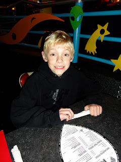
A beauty shot.
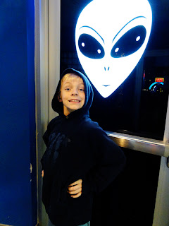

A character shot.
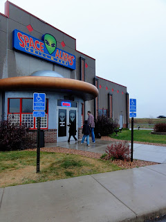

And a location shot.

NOTE: I do some minor tweaking of my photos. I find the auto color correction and auto correct work pretty well, especially with flawed, indoor photos like these. I also tend to add actions like Pioneer Woman's and CoffeeShop's to add color and character and fix lighting. I use the same action for all the photos in the event, mostly. Here I think I used Pioneer Woman's Boost.

Once I pick, resize, and edit the starring shots, I select a few SUPPORTING ACTOR shots, pnes that show what we did and who was there. I have created and saved various sizes of templates for smaller shots on PSE; for this LO, I though 3x3 photos would work well. I saved two to a 4x6 print. Here's my supporting photos:
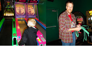
A guest (his brother) playing games and dad holding the prime tickets.


Birthday boys opening gifts and meeting an Alien.
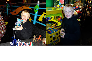

Birthday boy showing off a gift and posing by a favorite game.
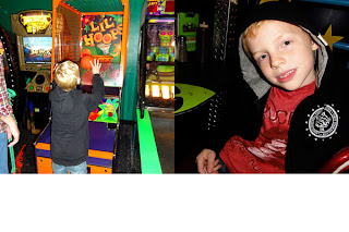
Birthday boy throwing some hoops and his brother looking happy.

I used the same Boost action on these photos.

These photos I sent to Scrapbook Pictures. I use them for bigger orders or ones with many larger photos, which are less expensive here.

Though I don't have the page designed, when I get these photos from the printer, I think it should be fairly easy to design the page, which will be 2 pages. I can picture the smaller photos in a line across the span and the three bigger photos in a line above them. And to make for a perfect moment, this line just came out in stores for me to use with this page.

Serendipity.

Wednesday, March 30, 2011

Submerged in photo editing

Since I have some upcoming crops and deadlines, I am trying to use spring break to select and edit photos, a harder task when I am a single parent (Derick is in Colorado). Specifically, I am working on the following:

  1. picking photos for Rowan and Dominic's school albums (a la Stacy Julian and Cathy Zielske)
  2. editing August 2010
  3. putting together a digital template for a photo collage for my Disney photos
  4. finding and printing Halloween photos.

My progress? I have accomplished task 1 for Rowan through April.

I think it's time consuming because working with masses of photos for extended periods of time makes my computer turn into a 90-year-old getting ready to walk a marathon. I have a fast computer, but it has limits still. So I need patience. And a marathon of Bones on DVD to relax me.

Here's a LO I completed before my mojo got sucked into PSE 7:


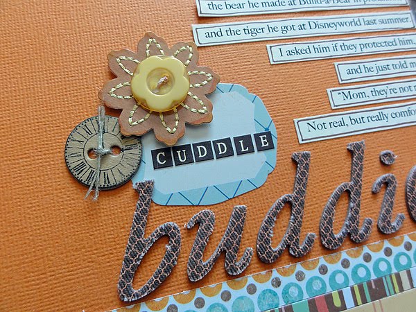
I took this photo with Rowan, thinking sometime he would like to see what he cuddled with every night.

The products come from Studio Calico's February kit Candy Shoppe. I felt motivated to use that kit, since I have a lot of March still and I am about to get April. This LO is probably my last with the kit. I got about 12 pages from the kit.

The photo was taken when I took these photos:

I got the idea for this page when I saw this postage stamp:

Yes, I bought postage stamps just so I could use one on a LO. The post office should take note: they could make a bucketload marketing to scrapbookers! The stamp made me think of my blond boy with wild hair and mischievous tendencies, who also has a stuffed tiger. Perfect combo.