Here's take-two of trying to post the trends I noticed at CHA and the products I loved and want to get. Hopefully SAVE will work this time.
Trends
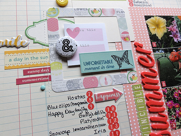
This project by Basic Grey is filled with many of the trends I noticed:
Here's what I saw a lot of:
1. Mustaches
Teresa Collins had a nice line that would work for both men and women called He Said She Said. On the left side you can see a sheet of paper with a 'stache of fun! (Sorry, couldn't help myself.) Lots of designers had mustache products. I know people have mixed feelings about mustache designs, so this trend could be a little hairy for some of you, but I think it will grow on you. Hee!
2. Arrows
These too were everywhere. Stamps, wood veneer, papers, and so on. Sorry if you don't like arrows, because it seems like they'll be on many, many lines this year. Since I'm a mother of boys, I'm OK with them--they're a nice accent for them.
3. Little bags
I saw these at a few places--these by Crate and in Webster's Pages too. Not sure what they are--glassine envelope-like bags with cute patterns.
4. Ombre
Not sure if this is the right term, but there were several places I noticed Ombre patterns, subtle gradations of hue. Like here with the Amy Tangerine latter stickers:
And these Thickers and stickers from the Studio Calico Sundrifter line:
And this line by Cosmo Cricket:
When used on a page like this:
The gradated color seems to add a hint of distressing, just achieved in a significantly less messy way than by misting or inking.
5. Speech bubbles
This is another trend that you either love or hate. Lots of companies had speech bubble patterns on their papers, in their stamps, in their dies. I like them--they are nice as a base for a title or embellishment cluster. This page by BoBunny has sweet and not-so-sweet phrases to use when scrapping all areas of your life.
6. Instagram/polaroid frames
Many companies--American Crafts, Jillibean Soup, Crate Paper--had papers or products with vintage-type frames on them, especially Polaroid and Instagram-ish filters. Fun.
7. Wood veneer
Studio Calico has had nice, unpainted Wood Veneer for a while; this time I also liked seeing it at Basic Grey and Prima. Also: note the arrows and speech bubbles. This year we will all be going places and talking on the way.
8. Acetate/acrylic
People were talking about Pink Paislee/ Heidi Swapp's return to the acrylic letters; I also saw this clear trend in other places, like Crate Paper and Basic Grey. I'm glad I never got rid of my vellum adhesive.
9. Project Life as an industry standard
I don't do Project Life, but after having visited the Project Life booth and checking out the lovely kits (hello, Jade), I admittedly found myself succumbing to the Siren-call of Project Life. Most companies must have heard the call too because they seems to size everything to fit those cards--the 4x3 size is standard for die cuts, mini-frames, page protectors, stamps, dies, and so on. In addition, companies like We R Memory Keepers and BoBunny have come out with smaller and cheaper Project Life-like kits. The WRMK set on the left has half the cards as PL but cost $10; the Misc Me line from BoBunny can see a wonderfully decked out smaller album for around $26.
Must-Have Products
1. 2-page page protectors
Lots of interesting combinations of page protectors, but this one, showed to me by Donna Januzzi, is clever: it's a two-page on by WRMK. Stitched together on the left side, it keeps your two-page layouts together even in 3-ring binders. Here it is in action:
2. EK Success Doily punch
As a mother of boys, I don't have much use for doilies, but I do love circles, and this punch by EK Success/ Martha Stewart was super easy, allowing you to punch various sizes. Can you picture this as the base for a wedding centerpiece?
3. 3x4 punch
This punch by WRMK is really perfect. True, you can size photos to 4x3, or you can use your trimmer, but a punch is quicker and easier. This is a prototype; it's expected in June, which should be just in time for when the new PL official kits arrive (heh).
4. Teresa Collins mini-albums and portable adhesive kits
Teresa Collins makes nice products, but it's not a line I tend to frequent, mainly because I think it tends toward the feminine. Someone told me I should check out the booth before I left, and I'm so glad I did. Lots of cool embellishments and unique products like these two mini albums and this portable adhesive kit:
I thought it would be cool to pack a mini in this sturdy box and take it with me the next time I travel.
5. Jenni Bowlin Punches
I know that some people think punches are dead since the Cameo is so convenient, and ubiquitous, but punches can go everywhere and are quicker and easier to use. I cannot wait to get the two-tab ones on the lower left and upper right.
6. Trimmer
How much would you pay for a trimmer that never dulls and always cuts straight? It's an interesting question about to become not-so-philosophical. This Fiskars ProCision Rotary Bypass Trimmer can do both, and it costs about $120. If my current Sure-Cut trimmer dies again (no pun intended), I might need to save up.
So this concludes my picks from CHA! What are you excited about? How do you feel about Project life? And how much would you spend for a trimmer that never dulls and always cuts straight?