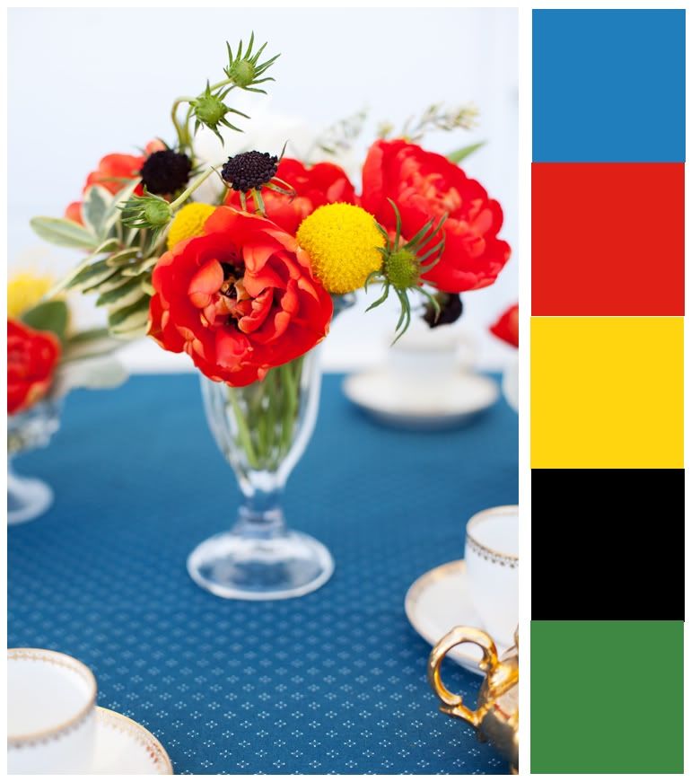
Blue, red, yellow, and green, plus a little black for drama.
In particular, this combo made me think of my boys swimming because their swim clothes are blue and red. Throw in their pool toys and towels, and the colors are all there! I grabbed the following GCD Studios papers and product:
 Vintage Audrey from Homespun Chic
 Pink Sparkle from Homespun Chic

Scandinavian Holiday Stripe from Scandia Jul

Vintage Birdie from Homespun Chic

Vintage Buttons from Homespun Chic
Since we've spent a lot of time swimming at different places this summer, I put together this page, an overview of our summer in the water:
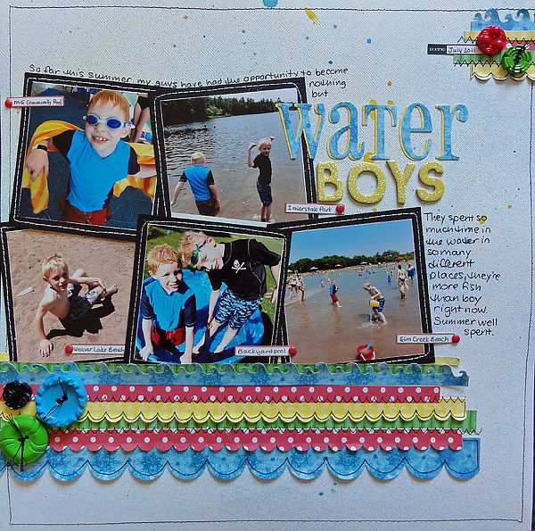
I misted the background with yellow and blue; the combo added a bit of green. I also misted the yellow, blue, and green patterned paper to saturate the colors.
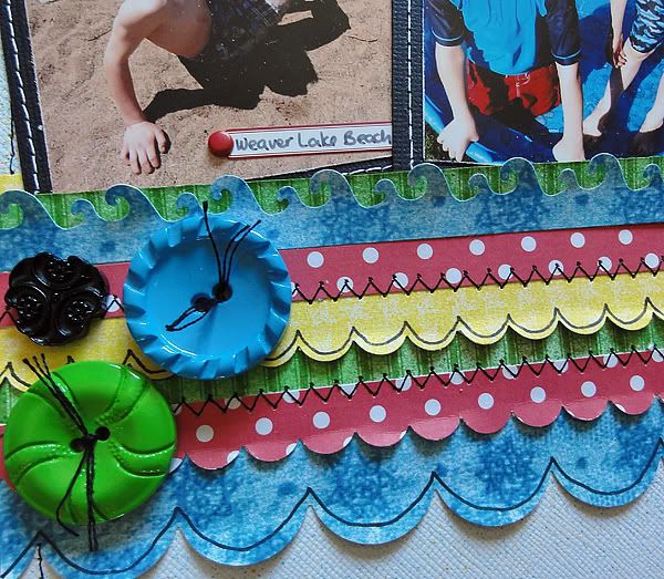
I punched the papers and lay them on top of each other sort of like waves.
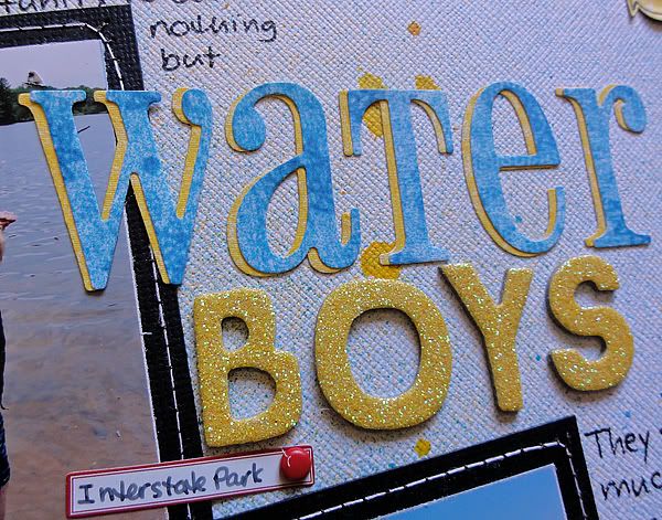 When I die cut a title, I like to cut it in two colors to add some depth.
If you have any photos of you and your family outside this summer, grab these colors and start scrapping!
3 comments:
Great idea to mist patterned paper to saturate the color! Big fan of this color scheme :)
What a fun color pallet! I love the punched strips and the pen work you did on them.
What a great page! I love the layering you did with the strips! :)
Post a Comment