I started at Echo Park, and this is the wall that epitomizes the style of many eye-catching booths: white walls, clusters of pages, fewer decorations. There are some amazingly decorated booths, but the ones I am gravitating toward are the clean and simple ones. Typical of me.
I loved the products and projects at Webster's Pages. I don't use them typically because they are more ornate than I scrap, but the projects in the booth did a good job showing how to use them for a clean page. The one above made good use of the Silhouette to use doses of the paper.
This next one has lots of stuff, including trim, but look how clean it is! It uses a spring/baby collection called New Beginnings--look at that adorable animal paper on the bottom!
And there are two things to note below: the page did a terrific starburst with patterned paper, but some are covered with overlays for extra texture and interest. Nice! Finally, those little coin purses are made with overlays. AMAZING.
I loved the new stuff with the new Fancy Pants brag books. They are bound differently to make it easier to remove covers and pages, a problem I noticed with my current Smash book; the fact that Fancy Pants addressed this concern is nice. and look at the creative way this Brag Book makes use of the template as a peek-a-boo into the next photo. For people without a Silhouette, or just anyone who likes to keep scrapping easy, these templates are cute and versatile.
Here's also an inspiring circle page from Fancy Pants:
Simple Stories Urban Traveler pages. The collection is AMAZING and the pages are inspiring. This booth was also where I ran into past Ella friend, current friend, Donna Januzzi! Though it was fun to travel the show earlier, it was more fun with friends.
This is the Silhouette booth, another clean wall. I love these projects, especially the one on the lower right. Wouldn't that be a good gift for a new parent?
And this framed page speaks to everyone who has a little monster in her life. Heh.
Lily Bee's booth was amazing. This gorgeous page with the banners as a photo mat was inspiring. I also love how it uses patterned paper as a background, not just white paper. Inspiring!
This one's hard to see--it was on the back of a ladder, and the twine is not part of the page. Still, patterned paper background and a cluster of papers at the top makes for a very pretty page.
Here's another look at a clean wall, this time Basic Grey.
They had two collections I loved, Hipster and Bowties. Perfect for moms of boys. If you look closely at the above page, you'll see something new to me: felt rubons. It made for an incredible title.
Bowties also connects with a feminine collection, Knee Highs. Bowties is boyish, Knee Highs is girlish, but you can use them both together if you have photos with both genders. Nice.
Look at the amazing stitching on this Knee Highs page:
After being on the Elle's Studio design team for the past six months, I was so happy to see Elle Price and her booth! News: she has three paper collections coming out with her new tags, and Donna and I decided we especially need to get Day to Day, a bright, fun collection. Here's some pages:
I tweeted about this yesterday:
Bella Blvd FTW.
There is some amazing stitching on this Bella Blvd page, and the banner card underneath is terrific.
I'm not a feather person, but this page used feathers well:
My Mind's Eye had their typically beautiful products. I loved this grid layouts:
And this next page from Crate Paper used an already out collection, Fourteen, but the fussy cutting was incredible. I'll go back to Crate today to take some photos of Maggie Holmes' new collection.
Right around the Becky Higgins booth We ran into listgirl, Christine Newman! We have plans for some of the Becky Higgins collections. they were inspiring.
Studio Calico had their usual lovely layouts demonstrating their products. Here were some of the most inspiring:
Living under the rock I have apprently been, I did not know that Studio Calico was releasing patterned brads! They are used terrifically here. Check out the colorful stitching.
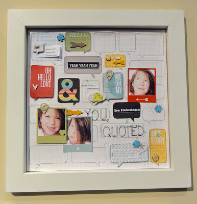
Speech bubbles are huge at the show, as are mustaches and arrows. Here a misting template with speech bubbles was used to create patterned paper by outlining.
Sometimes die cut tags can be used for alternative uses, like as a photo frame...
---or as a date in a pocket. Check out the awesome photo frames here too.
Finally, lots to love on this page, but in particular I loved the vellum photo pocket with the subdued title and the stitching over them both.
I'll be back at the show tweeting, posting on Pinterest, and otherwise sharing the inspiration I see!


6 comments:
I KNEW you would like the Bowties line from Basicgrey! Thanks so much for putting this all together!
Great post Jenny - thanks for sharing all these photos - and great to see Donna too!
I was following you on twitter yesterday and had such a good time, and looking forward to following you again today. I really like many of the things you posted. I do believe our tastes are very similar.
LOVE!! You are so lucky that you go to go! I am loving seeing all the new releases!
SO SO awesome to meet you at CHA! Yes, we have plans for the Becky Higgins Project Life journal card swapping! Woohoo!
So fun to see! We'll have to tour together again one day!
Post a Comment