1. I select photos and make a sketch. I use sketches by others, but most of the time I select photos and sketch what I want to do with the photos. Here's one I did recently. The sketch (sorry for the bad scan):
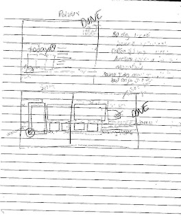
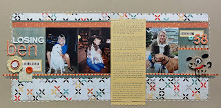
And the layout (click on images to see them bigger):
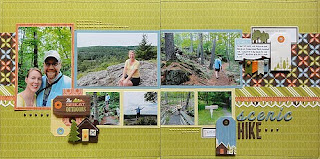
(Confessions: this was for my American Crafts design team application.)
2. I have a line span the two pages. I love strips of patterned paper, so having some connect the two pages works for me. Lots of people commented on doing something like this to create two pages.
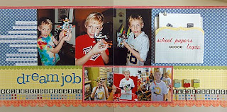 In this case I had a lot of lines span the pages--lines of paper, painted images, photos.
3. I connect the pages with a line of photos. I'm a linear gal, so lining up photos across the pages is an easy choice to make.
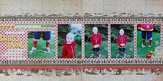 This is a new one I made. Most of the photos are the same size, though I didn't smoosh them together like I usually do.
Here's some older ones with a line of photos:
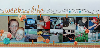 Last year's Week in the Life. I don't have the luxury of space in my house to be able to create a whole album about a week, so I did a two-page spread with hidden photos. Easy to line up photos if they're all the same size.
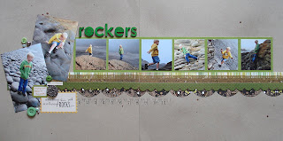 I trimmed leftover 4x6 vacation photos for this LO.
4. I balance embellishments across the pages. Another piece of advice people commented on. I am a slave to the visual triangle, so I often use that on a two-page spread. I tend to put those embellishments by the title, the journaling, and the important photo.
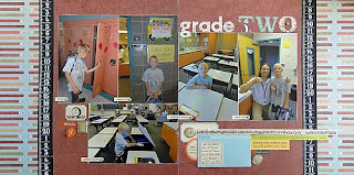 I used the GCD Studios line Elementary, My Dear for this spread. In this case, I used the embellishment clusters on both pages to balance the pages.
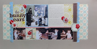
5. I arrange my layout in a mini-block. This is a layout design I'm using fairly consistently on an occasional project I started at last year's Big Idea Festival called 100 Moments. I trim photos to fit into a block, and I fill space with patterned paper. I used patterned paper to "bookend" the photo block either on top on bottom.
Much of what I do was reflected in some way by what readers wrote. Here's a master list (Some comments doubled each other; I tended to only include the advice once, unless it had a slight nuance to it. Judgment call.):
- Have fun and don’t worry about the layouts looking the same
- Use a sketch or copy someone else!
- Create a visual triangle spanning two pages
- Mirror something from the left side to the right in opposite ends of the page span
- Think of it and work on it as a big one-page layout.
- Only use your favorite photos and use those to pick your embellishments
- If using a one-page sketch as inspiration, mirror or flip it to make it two pages.
- Use something—a large shape, a strip of paper—to span both pages
- Use patterned paper to “jump the gutter”
- Use an odd number of photos in various sizes
- Arrange photos in a “c” in any direction to draw the eyes across the page
- Select papers first, then photos, then a sketch. Use embellishments last to fill spots
- Just do it!
- Stick to one pagers—ha!
- Start with a good story
- Have fun
- Make it flow from left to right
- Make the eye-catching elements flow across the page like a backwards 6 (learned from newspaper design)
- Combine two one-page sketches to make a two-page sketch
- Do something symmetrical on both pages
- Use similar color or embellishments on both sides to add continuity
- Start with the photos and two pieces of white paper to work out the placement
- Balance photos, colors, and embellishments
- Connect the pages with a line
- Scraplift the heck out of people!
- Use a design element to tie the two pages together
- Look at magazine spreads for design inspiration
And here's something sad: I wanted to add three more just to make it an even 30! That explains a lot about how I scrap, LOL!
1 comment:
Oh, I so struggle with 2-pagers. Once I discovered Allison and Debbie's sketches, it's the only way I can do a 2-pager anymore. But I love your advice! Great tips I can deploy if a sketch book isn't handy. :)
Post a Comment