Here's the first page I ever did:
 I took the Basic Scrapbooking class at Archiver's to do this page. I like the continuity between the two pages, but check out the deckle edged scissors I used on the journaling blocks. I still have them, I think, but I can't remember when I last used them. Also note how I flocked the title to mimic snow. I started out pretty techniquey.
This next page demonstrates a couple things I did for a while quite regularly: stamp on my layouts, and use Becky Higgins sketches. I also like how I handwrote the title--creative lettering, anyone?
 I really like this next one. I can tell my photography skills are getting better. I think it's still a Becky Sketch, and I love the mix of patterns on this monochromatic layout. I'm also proud of that memorabilia pocket I made.
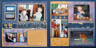
 This one was an online challenge, I think. I really find those inspiring. Again with the stamping and the mix of PP. I can tell I had fun with this layout. And check out Roswell and the light saber--isn't that cute!
 Right here is where I started to find myself as a designer. I remember doing this page. I had printed a TON of egg dyeing pictures, and I finally narrowed it to three, I like my grid, I like the colorful accents that are not themed. (I was a Theme Queen for several scrapbooks--if I did a page about baseball, I got baseball paper, about bicycles, I got bicycle paper, etc. I find that I get a lot more use out of my stash when I use non-themed products.)
 Here I'm more me. I used spring papers on this snowy LO. It's a linear page that also has a triangle in it--I tend to love asymmetry on my pages, oddly enough. I like how I used that die cut as the main accent, and I like how I used other products like brads and a journaling spot to create some visual interest.
 I just pulled some pages that struck me from my past albums. Loads of fun to see what has stayed the same and what has evolved. I like clustering accents much more now, but I think that comes from now having a stash-if you've got it, use it!
3 comments:
OK this might be totally random but I love the little half circle with the journaling on the last layout. Sweet, perfect touch.
It is soooo much fun to watch our evolution as scrappers! I look back at some of my earlier pages and cringe/giggle!!! Your early pages are remarkably clean and restrained!
love your style...thanks for sharing the progression!!
Post a Comment