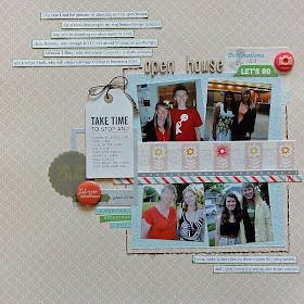
I noticed that I did this at this past weekend's crop. Within a day I unconsciously used the same design scheme on two different layouts--but they look different, even though the basic layout is the same. Here's the first I did:
I had four 4x6 photos. I trimmed them to fit inside these Crate Paper frames, which I LOVE. I set them on top of some patterned paper as a photo frame ans alligned it right because that is what I tend to do.
And here's the title detail:
I pulled some stickers from the kit, then dug into stash for tags, more stickers, buttons, and more. I slip the tag twine under the sate sticker and through the O for a tie. I like it.
The next one I did the next day. Again, I had four small square photos. Again I aligned them left on a photo block. Here's the page:
Several obvious differences: smaller photos, no chipboard frames, a dividing piece of paper between the photos. Aside from that, the orientation is the same. But it looks different with those few changes.
And the details:
You can see that I did something similar embellishment wise to the left side of the photo block. I layered embellishments, some on dimensional stickers, picking ones that fit the theme, the future. The actual title I set above the photo block.
Thank you for looking at my page! So how do you feel about reusing the same design again and again? :-)


Why reinvent the wheel? I love both pages!
ReplyDelete