Friday, March 30, 2012

Star Wars Crafts

A few months ago I found the book Star Wars Crafts, I think when I was shopping for Christmas presents at Barnes and Noble. I showed it to the boys, when were not interested. Recently, however, they each pulled it out and asked me to make something from it. Since it was spring break, I did.

I made Dominic's project first: a Yoda finger puppet.


The easy part was first: cutting the fabric. Of course, I discovered then that I had a dull pair of Fiskars.


Next, sewing a miniscule piece of fabric. It's kind of tricky to sew felt, and a couple times I got too close to the edge and had to resew, but eventually I got it.


I stuffed the head, sewed the robe on it and voila!


Happy boy. It took only one time of the dog grabbing it before he learned to keep it in his room.


The next one was trickier: a Tooka doll from the clone wars. It was actually pretty small, which made turning it inside out after sewing kind of tough. I pulled a lot of threads doing it. Still, I got it repaired, then stuffed it, and started on the hardest part: adding the ears, arms, and legs. Handstitching.


Please know that I love stitching on pages, but actual sewing? I made this page to commemorate how I feel about sewing:


It took me all day to hand sew. I added the first purple strip and was reminded of an Olivia Newton John video:


When I added the second, it looked all right.


Even better, Rowan played with it all day.


The force is with me. Always.

Monday, March 26, 2012

Yellow and brown and blue

I thought I'd share a sports page I made using non-sports papers, using some amazing GCD Studios papers.

My younger son loves sports, even though he's not a formal participant right now. I have a collection of photos I've taken of him messing around with various athletic gear, so I decided to put them together on a page.

I LOVE this yellow paper "Sunswept" from the line Splendor:


It reminded me of the colors in the basketball photo of my son, so I used this paper as the backdrop. I then picked a bunch of brown and dark yellow papers from the same line to add to the page, "Letter Tiles," "Zig Zag," and "Heirloom." To add some contrast, I picked this energetic paper "Woven Chevron" from Splendor as an accent paper:


I hand cut a line and added it to the middle of the browns.

I wanted small bits of blue throughout as well, so I punched tiny circles from the B side of "Pink Flora." I added them to the yellow paper and did some hand stitching. Here's how the page ended up:


I love how versatile this collection is! Have fun playing with Splendor, even for some pages that you might otherwise only use themed products on.

Friday, March 23, 2012

Scrapbooking screw-ups

My post the other day made me think of my biggest scrapbooking mishaps, so I thought I'd share them with you.

If you've scrapped with me before, you know my mantra: There are no mistakes in scrapbooking, only unplanned opportunities for creativity. Heaven knows I've had plenty of chances to put that mantra into practice. Here's some of those moments:

1. Torn paper after moving stickers. Most recently, I lifted stickers after I'd adhered them and they slightly tore the paper. Confession: I do this all the time. I'm the only person in the world that's happy when Thickers don't adhere well.


I don't think anyone will notice. Except maybe me, but in a few years, even I'll forget.

2. Mystery Goo. I made this layout for Sketch Support, then when I went to photograph it a day later, I noticed Mystery Goo. It had ruined some photos and splattered on the background. NO CLUE what happened, though I wonder if my younger boy had sprayed a lot of leave in conditioner in his hair, thinking it was hair spray and then Dripped. I replaced the photos, but was in turmoil about the  other splatters until Lisa Truesdell on Studio Calico suggested I spray the whole page with Mister Huey Shine, which is now at Archivers. Very nice solution! Pun intended.


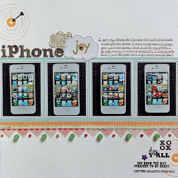
3. Messed up embossing. Right now I love to stamp and emboss, but I tend to make a mistake with the stamping so that the image takes less ink and therefore less embossing powder, thereby being Screwed up. Here's an example:


I did this page for Twelve, commemorating a Thing, in this case my iPhone. I thought the bullseye stamps and more particularly the words would express my affection well. They did, but I stamped AFTER I'd adhered the dimensional accents. I hit them when stamping, meaning less ink, meaning no embossing powder on parts of the image.

X%&#!

I used a Zig pen to fill in where there was no powder.

4. Water on a layout. This was a big oops that was totally not my fault, aside from the fact that I gave birth to the culprit. I blogged about it on this post, and I did repair the page well, but let's just say I'm VERY sensitive about my sons touching anything with water near my pages.


5. Mist oops. If you mist, you will have to deal with oops. In this case, I messed up one project on a page I was making. I loved the paper, and I had two pieces, so I did it again and saved the mistake. I used the mistake on this layout, covering most of the misting. Covering is a good way to deal with mistakes. (If you're curious, the misting oops involved too intense color.)


6. Stitching screw-up. I like to stitch around the exterior of a page, especially if the exterior looks white and empty. I tried that here, but I must have wound my bobbin badly, for the stitching had poor tension: some stitches had wide loops showing up above the page. On top of it all, I ran out of bobbin thread and didn't notice for half a page. To fix it, I ripped some stitches, pulled threads tight and taped  it on the back, then stitched again and again to mask the irregularity. When it looks bad, make it look like you did that on purpose. :-) Be whimsical.


7. Crushed paper. This was a rarity. I scrap in my living room, in an easy chair, on a lap desk. I keep my projects there in progress. Miraculously, my boys have never messed up a page, barring the water mess up. My pets haven't either, except some supplies that disappeared recently that I think my dog ate. The biggest page mess up happened because of me. I tripped over the dog, fell on the page, and crushed the background paper.

What could I do? Nothing, really, because the paper was ruined, so I removed the photos. (Helpful hint: when you need to remove photos from a page, flip the page and pull the page off the photos. You'll save the photos and probably save a lot of the background paper too. If you remove the photo from the page, you'll bend them and ruin them.)

I then replaced the ruined paper with another one, and truth be told, I liked it better. Here it is:


I hope you click on the layout and read the journaling, if you can. My mother-in-law was an amazing woman, and an incredible artist. She studied photography with Ansel Adams. I am so glad I had the chance to interview her about this before she died. That interview was definitely NOT a mistake, so I invite you to interview an older relative about something you know a little about but should know more about.

Friday, March 16, 2012

Patterns and colors

Now that my grades are in for trimester 2, I can start posting more frequently--and scrapping more frequently, for that matter!

Here's a layout I did about a week ago. I was inspired by an email challenge in the Big Picture class Twelve to pick patterned paper in my favorite designs and colors and use it on a page. My favorite patters? Circles, stripes, text, woodgrain, and grid. My favorite colors to scrap with? Bright yellow, orange, and green.

I decided to put the design on the text paper so that the colors would pop. Since the colors matched the photo I had, I made a page about my husband's penchant for sending me flowers at work, especially when I ask him to. :-)

Here's the page:


I used the tags from the flowers I've gotten this year as the journaling.


The border was fun to make. I cut some paper into strips, then punched the yellow paper into banners using my Jenni Bowlin/Fiskars banner punch. I layered it on top of the orange woodgrain, which I'd punched with scallops. I finished it off by laying strips of stripe and an old Doodlebug paper frill on top.


I totally thought all these brads were the same color!

What are your favorite patterns and colors? Have you ever tried pulling the papers and patterns first, then picking the photos? I found it inspiring; you should give it a try!

Thursday, March 8, 2012

I'm a detail gal

What can I say? I'm a detail gal. My colleague described me perfectly. He's a big picture person, so he'll compose a document putting together the whole plan for the paper unit, and I'm the one who asks, "What does #3 mean?"

That habit translates into scrapbooking too. Designing the page comes quickly for me; depending on the photos and story, the orientation tends to fit together best in only a few ways. There I'm not so creative.

Once I build the foundation, I go to town with the details. Being a relatively linear and simple gal, I don't like the details to overwhelm the page, but I do like them to be eye catching and to invite the viewer in to look again and closer. Here's the latest page where I did that:


I did this page for the Big Picture class Twelve. I didn't include the bigger photo of my boys on the camping LO I made, so I pulled older personality shots of the boys and put them altogether on this page to write about how they are rich in personality.

Here's some of the details I love and add to page after page:


1. Misting. Here I just did light sprays of Studio Calico Mister Huey Clover and Lemonade.


2. Layered border punches. I got the idea for the staggered layering from this pin on Pinterest.


3. Label stamps to identify photo locations. I tend to do this on multiphoto pages, of which I do a lot. These stamps I got in a kit from Studio Calico a long time ago. I use this punch by EK Success for them.


4. Stitched photo corners. This is a quick and easy WOW to add to pages. Lay down a ruler and punch holes every 1/4 inch. Then backstitch using three strands of DMC. 


5. Journaling strips. I space the journaling 1.5, then trim them and adhere them. I usually outline, though in this case I misted then inked the edges.


6. Stitched title in two different fonts.  Make sure you machine stitch before adhering the chunky accents. (The dog hair is an unintended detail.)


7. Cluster of small embellishments, usually on a larger paper base. That's what stash is for. (By the way, note the damaged paper where I removed then reapplied the gem zigzag. Oops.)

So there's a few of my favorite details. What are some of your favorites that you like to add to a page for a little somethin' somethin'?

Saturday, March 3, 2012

Non-themed theme layouts

The class Twelve that I'm taking over at Big Picture Classes has been terrific. I have been able to scrap so much more than I have, and on a variety of topics, too. This page is under the category "People," and it's about my son, who has had a lot of homework in third grade and is not liking it. His reaction to the homework, I'm not liking too much either. I'm becoming a drill sergeant, goshdarnit. Here's the final page:


When I made the layout, I didn't want to dig into my bins of themed supplies. (I keep four bins, one for Christmas, one for Halloween, one for Travel, and one for School. Any other theme I can use stash for.) Instead, I grabbed a Studio Calico kit I wanted to use more of, January's County Fair. Not schoolish, but bright and fun.

I started with the kraft number paper Good Measure by My Mind's Eye. Most of his homework is math, so that seemed fitting. I added the bright strips of patterned paper along the photos for fun. The last strip I used my EK Success Bumpy Road border punch, since that seemed fitting for the story.

For accents, I dug into the October Afternoon Sasparilla Flower Sack and buttons for the most part. I picked some of them to fit the school theme: the stars, of course, and the lined or graph paper die cuts:


For the title, I used a Russell and Hazel sticky note to make the title stand out; again the stars and lined paper suggested school. I picked "Giddy-up" since that seems to be what I'm saying to him when he comes home from school and needs to get started. The Ace of spades I picked because of the letter A, suggesting grades (I'm ignoring the playing card's ominous qualities!). Finally, the "Winner Winner" chipboard is my goal for him, should he continue with his hard work. I added buttons just because.


So that's my way of turning non-themed products into  a themed layout! Remember that the next time you feel like you need to go shopping for a themed product. Check out what's lurking in your stash, unnoticed!